Contrast, Alignment, Repetition, & Proximity
Assumptions:My users will be students in an 11th-12th grade Honors Physics class. As such, they have strong reading and technology skills.
Why this layout will work:
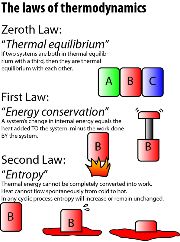
For this design I focused more on the text and layout than images, compared to the previous assignment. A few of the elements I incorporated from the text include: using larger and bold fonts to give contrast to the titles, keeping all text left-aligned (for ease of reading, ref. page 201), repeating the red "B" shape throughout to give a sense of unity for all three concepts (pg 203), and keeping images in close proximity to their associated law to indicate a relationship. I think overall this layout really makes good use of all four of the actions from the text in order to convey a message.
Feedback & Changes:
I will await feedback from my peers to see if any further revisions are suggested.
Why this layout will work:
For this design I focused more on the text and layout than images, compared to the previous assignment. A few of the elements I incorporated from the text include: using larger and bold fonts to give contrast to the titles, keeping all text left-aligned (for ease of reading, ref. page 201), repeating the red "B" shape throughout to give a sense of unity for all three concepts (pg 203), and keeping images in close proximity to their associated law to indicate a relationship. I think overall this layout really makes good use of all four of the actions from the text in order to convey a message.
Feedback & Changes:
I will await feedback from my peers to see if any further revisions are suggested.
