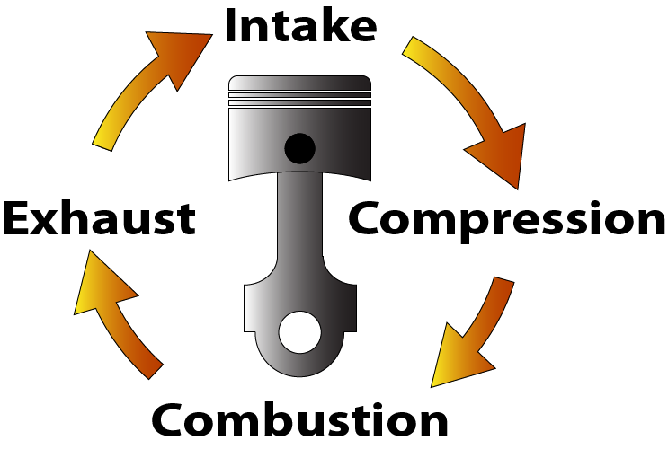
The four-stroke engine cycle
Users & assumptions:
My users will be students in an 11th-12th grade Honors Physics class. As such, they have strong reading and technology skills.
Why this graphic will work:
I have focused more on shape, though elements of typography have also been incorporated. My intention is that first and foremost the circular arrangement conveys the cyclical nature of the four-stroke engine process. There are four orange arrows constructed directly along a common circular path that lead the viewer's eye from one stroke to the next, and continuing upon reaching the start. One of the elements from the text I have incorporated is from Chapter 10 (pg 251), in which there is an example of shape tools being used to show processes. Much like the example of the inquiry cycle, my diagram of the four-stroke cycle is cyclical.
Though it is not as obvious, a few design choices did factor in to my creation of the text. My primary motivator for designing the text was legibility - I wanted the four stroke names to be very easy to read. To do that, I chose a font with a generous x-height and counter. X-height is discussed on page 232, where it is indicated that a larger x-height makes a font easier to read. Similarly, on page 234 the book discusses the width of letters' empty middle spaces, called counters, and indicates that wider counters may lead to easier readability
Feedback & changes:
Preliminary user tests indicate the greatest strength of this image is its circular, directional shape, making it very easy to understand the cyclical nature of the four stroke process. A possible weakness discussed is that it conveys a main idea but is not a stand-alone teaching tool. I was not sure by the nature of this assignment if it was supposed to be a stand-alone. Further feedback and changes will be discussed after getting feedback from my classmates.
