Figure, Color, Depth, & Space
Assumptions:My users will be students in an 11th-12th grade Honors Physics class. As such, they have strong reading and technology skills.
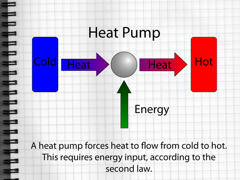
Why this layout will work:
I tried to take into consideration all of the concepts from this week's reading. To start with, the concept of "Figure" has to do with foreground and background, which the text refers to as "figure" and "ground," respectively. With this image I have experimented with using a paper background texture. I thought this might be a way to add interest to the overall image without distracting from the content on it. I'll await feedback to see if it is successful or distracting.
As cited in the text, Tufte (1990) describes the four instructional functions of color as labeling, identifying quantity and measurement, representing reality, and creating aesthetic appeal. I think here I have used color to represent reality, in a sense, because I have represented cold with the traditional blue and hot with the traditional red. This will make it easy for users to immediately differentiate temperature, and see that it is flowing from cold to hot.
For depth, images can use scale, dimension, and texture in order to facilitate selection and make what is important stand out. On this image I chose to use texture in the background to make the shaded and solid objects prominent.
I'm not sure I did such a good job with space this week, though I did better than my margin-less graphic from last week. Let me know what you think!
Feedback & Changes:
I will await feedback from my peers to see if any further revisions are suggested.
Thanks!
Brian
